Going (to) APE

Yesterday I went up to the Alternative Press Expo (APE) in San Francisco. I’ve known about it for years, but I’ve never gone; it seems like every year someone at the comics shop would ask if I was going, and I’d say, “Oh, is that this weekend? I already have plans…” But this year I planned ahead and put it on my calendar. It helps that you don’t have to preregister to attend (if you arrive just as the doors open, it doesn’t even really save you much time in line).

When I arrived, I wondered how long it had been since I’d gone to a comics convention. As best I can recall, I haven’t actually been to one since a little convention in New Orleans back in college, around 1989. Madison didn’t have any, and I know I didn’t go out of town for them, and I’ve never gone to any of the local cons (although I hope to get to Wonder Con next spring).

APE is being held in the Concourse Exhibition Center, which is in a part of town I’d never been to before. It’s about 4 blocks from the CalTrain station, in an area that seems to have been renovated since AT&T Park as built 10 years ago, but which still has some older buildings. It’s across from the “San Francisco Fashion Collective”, which seems like an “only in the first world” sort of organization.

The con itself is primarily a large showroom of vendors and artists, with some programming and some sessions on creating and producing comics. As the name says, the con is geared towards independent comics companies, not the major ones. The “big name” publishers at APE are Fantagraphics, Slave Labor Graphics (SLG), Last Gasp and Top Shelf. So my goal in going up to the con was to find some comics to read that I wasn’t familiar with, and get exposed to some new stuff. On the other hand, I’m not really a fan of “slice of life” comics which have been hallmarks of independent comics over the last 20 years (the sorts of books by APE guests Lynda Barry and Daniel Clowes), and I also have a strong preference for polished artwork and a mild preference for colored artwork. So, would APE be for me?

Going to conventions is always a little awkward for me anyway, since I’m never really sure how to approach them, and it reminds me that I am, at heart, not very social, so I feel uncomfortable chatting with the people in the booths. I also feel awkward around actual writers and artists, partly because I don’t want to offend them, by looking at their wares and not buying them or by saying that I’ve never seen their work before. APE worked both in my favor and against it, since I assumed that most creators at the con were there in large part to get their work in front of a larger audience who’d never seen it before, but on the other hand most of the people behind the booths were the actual creators and not, say, staffers from a retail store.

I got to the con shortly after opening and spent the first couple of hours walking around looking fairly briefly at each booth, planning to look at the ones that looked interesting to me in more detail later. Some of the vendors had “sales pitches” as you walked by, while others didn’t (perhaps unsurprisingly, the degree of personal outgoingness among these folks who are writers and artists varied widely). My first purchase was from Barry Deutsch, creator of Hereville: How Mirka Got Her Sword, largely because he did have a witty sales pitch, asking if you’ve been looking for a young adult story of an orthodox Jewish girl who really wants to go off on fantasy adventures. It’s a nice hardcover with attractive artwork, so I picked up a copy (here it is at Amazon).

The next artist to grab me was nearly the last one I walked by: He had a set of nice color art prints up, and one titled “The Adventurers” attracted my attention because it was large and colorful and extremely detailed, but the one underneath it, “Wishing Well”, really sucked me in because it had a terrific color scheme, beautiful execution, and a really neat idea behind it. The artist was Travis Hanson, who specializes in fantasy art focused on children and young teenagers, and who also does free sketches – lots and lots of free sketches – a sketch in every book you buy from him, and an additional free sketch on sketch paper. His sign said he’s done over 900 sketches at some conventions! He and his friend who was working the booth were both friendly and talkative and very approachable. I picked up all 6 issues (to date) of his series The Bean, and went back later for some of the prints. Really nice stuff.

Other things I bought:

A pretty good haul, all things considered. For the most part I picked books which initially attracted me with art styles I liked, and which seemed to have interesting stories too on closer inspection. There were a few books that had nice-looking art, but whose stories didn’t grab me when I thumbed through them, and one or two others which had stories that seemed interesting but the art just wasn’t for me. Given how much I picked up, I don’t feel like I really missed out on anything. Two books I arguably “should” have picked up, but which I decided instead to read first in their Webcomic form, were Templar, Arizona (which I’m already part-way through) and Family Man.

A friend of mine, Becky, also went up to the con, and we had lunch together, and later rode the train home. (Well, I got off a little early to meet Debbi for dinner in Menlo Park.) I don’t see her very often, so it was fun to hang out and chat with her.

All-in-all I had fun, even if I did feel awkward for much of the con. Despite being a life-long comic book fan, I’ve never really felt connected to the larger comic book community, other than occasionally chatting with folks at my local store. But I found a lot of neat stuff at APE, and I certainly hope to go back next year!
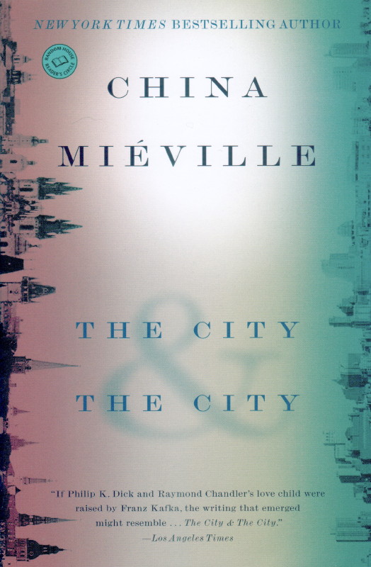
China Miéville: The City & The City

  • The City & The City

    • by China Miéville
    • TPB, Ballantine/Del Rey, © 2009, 312 pp, ISBN 978-0-345-49752-9

I read this year’s co-winners of the Hugo Award for Best Novel back to back, starting with China Miéville’s The City & The City. Fundamentally, the novel is a mystery: In the eastern European city of Beszel, a woman’s body is found dumped in the trash. Inspector Tyador Borlú investigates her murder, but quickly runs into a problem: not only does no one know who she is, but she appears to have been murdered in Beszel’s sister city of Ul Quoma and her body brought back. But Ul Qoma occupies the same physical space as Beszel, only slightly shifted in dimensions. The two cities are separated by language and culture, and despite “crosshatchings” where the two cities bleed together, their separation is reinforced by a mysterious organization called Breach, which monitors people violating the laws of both cities.

The dead woman is eventually revealed to be a foreigner, and Borlú follows her trail through the fringes of society, groups who champion their own city’s individuality, and those which want to bring the two together. Eventually Borlú travels to Ul Quoma, where he works with detective Qussim Dhatt to track down the killer from that side.

The book is rich in the mechanics of how the two cities stay separate, yet interact through well-defined channels, but how it plays with its premise is ultimately unsatisfying. Hints of the origins of the split between the two cities are dropped, but the truth is lost to antiquity. I understand that Miéville decided that this book wouldn’t be backwards-looking, but the story doesn’t really develop its premise, keeping it constrained to the basic set-up of the divided sister cities, not really expanding on the theme, developing it, or transforming it or the cities through the progress of the plot. While in a way Miéville’s restraint and discipline is admirable – sticking strictly to the plot of the murder mystery, not using it as a vehicle to explore the fantastic premise as the premise as a backdrop to the story – it’s disappointing that such a rich idea isn’t developed more fully.

Miéville is a strong “colorist”, excellent at crafting a world in minute detail and bringing it to life, but his plot and characters tend to be dry, and the story develops slowly, and this book fits right in with Perdido Street Station and The Scar in that regard. Even when the story finally heats up in the final third, it seems to lope along without a sense of urgency, or with much concern that the events at hand are going to have a big impact on the characters.

Overall The City & The City is frustrating for its lack of ambition – not that Miéville doesn’t do his usual strong job of painting the world, but that he doesn’t really do very much with it. Certainly nothing like, say, a Vernor Vinge might. It feels like a very small story in a world the author seems to be actively fighting to keep under control. And unfortunately that just makes the novel feel like much less than it should have been.

Book Discussion Prologue

At last night’s book discussion, I sat down between L, the moderator, and N, another attendee. Then the following exchange took place:

Me (just being a goofball): Wow, now I’m between a rock and a hard place.

pause

L: Hey!

N: Wait… which of us is which?

Me: I’m going to let you work that out between the two of you.

pause

Me: Wait, I’m between the two of you!

Not Quite The Weekend(s) I’d Planned On

Last weekend wasn’t the weekend I’d planned on because I spent most of it at work. It was, at least, a very productive weekend at work (and we got lunch delivered), but still, not really what I’d planned on.

This weekend was at least not spent at work. Unfortunately, I’d planned to go to a Magic draft yesterday afternoon (I’m trying to do one per month, since I really enjoy doing them but it’s hard to set aside the time), but when I showed up at the store it turned out they were doing a different sort of tournament and not a draft. So away I went disappointed. Though I did swing by Comics Conspiracy for their fall sale and found a few things. I spent the afternoon organizing stuff in the front room instead, which wasn’t really bad, but not what I’d wanted to do.

Today we went to the Moss Beach Distillery for their Sunday champagne brunch. I was disappointed to see they no longer had their gingerbread pancakes, although their french toast is quite good itself. And we sat on their patio and enjoyed the (foggy, but warm) weather afterwards. But this trip wasn’t quite what we planned since we got stuck in massive traffic both going and coming back due to all the pumpkin patches in Half Moon Bay. It wasn’t a total drag, but still.

All of these I guess are “first world problems”, but I’m still bummed about the draft – I’d been looking forward to it all week. Ah well.

This Week’s Haul

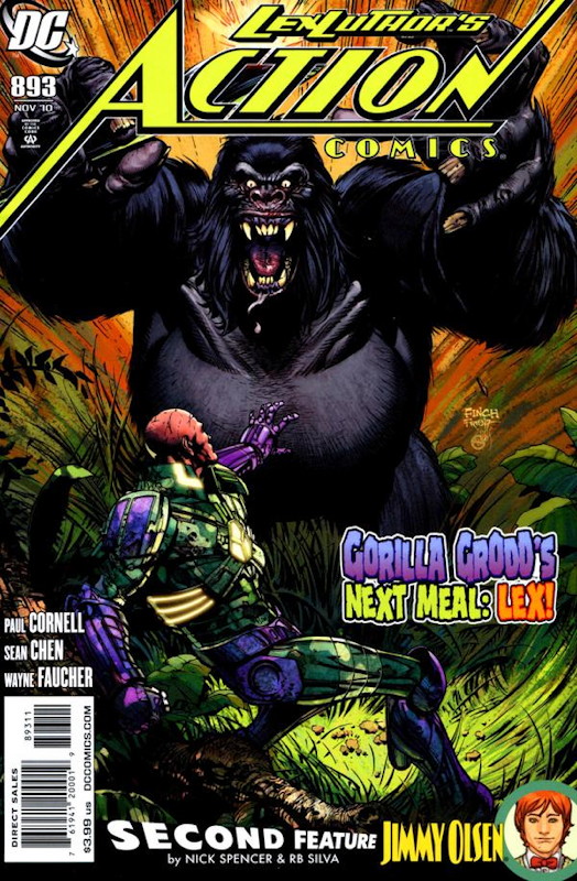
  • Action Comics #893, by Paul Cornell, Sean Chen & Wayne Faucher, and Nick Spencer & RB Silva (DC)
  • First Wave #4 of 6, by Brian Azzarello, Rags Morales & Rick Bryant (DC)
  • Justice Society of America #43, by James Robinson, Jesus Merino & Jesse Delperdang (DC)
  • Time Masters: Vanishing Point #3 of 6, by Dan Jurgens & Norm Rapmund (DC)
  • Wonder Woman #603, by J. Michael Straczynski, Don Kramer, Eduardo Pansica, Allan Goldman, Jay Leisten & Scott Koblish (DC)
  • Captain America #610, by Ed Brubaker, Butch Guice & Rick Magyar (Marvel)
  • Casanova #3, by Matt Fraction & Gabriel Bá (Marvel/Icon)
  • Powers #6, by Brian Michael Bendis & Michael Avon Oeming (Marvel/Icon)
  • Chew #14, by John Layman & Rob Guillory (Image)
In Action Comics Lex Luthor outthinks Gorilla Grodd, but later events set up next issue’s much-heralded story with Death from Sandman appearing in the DC Universe. Of more significance (to my mind) is that the fill-in artist is Sean Chen, whose work I’ve enjoyed ever since he illustrated Kurt Busiek’s Iron Man series a decade ago. Unfortunately he hasn’t regularly drawn a comic since then, so we only see him for a few issues at a time.

The back-up story has gotten some advance press because it introduces Chloe Sullivan (from Smallville) into the DCU, as a rather grumpy ex-girlfriend of Jimmy Olsen. Jimmy’s now being portrayed as something of a slacker, compared to more successful members of his generation, and his friendship with Superman being a bit overblown. It’s rather the opposite of what Grant Morrison did with the character in All-Star Superman, and though I give Morrison a hard time these days, I much prefer his take on Olsen. So the story is actually rather depressing, and the sudden reverse at the end (in which Jimmy seems a bit more heroic, albeit contingent on him actually doing something) just makes it seem ridiculous on top of that. One wonders what the point of this exercise is – I’d rather see Cornell write a companion story to the lead, as I’m sure he’s got plenty of ideas in his head. But this Olson story is not really much fun, so why bother?

More Webcomics I Read

It’s been a little over a year, so I thought this would be a good time to follow up on my post “Webcomics I Read” with a list of some others I’ve started following since then:

  • Aardehn, by Eric Vedder: A high fantasy comic involving a heroine who’s bonded to a demon, and maybe the subject of a prophecy, as well as an evil sorceress consorting with demons and an elf trying to escape her clutches. The story doesn’t set the world on fire, but Vedder’s art is gorgeous (though decidedly on the hot-babe end of the art spectrum, in case that’s not your cup of tea). Seems to be on hiatus since June.
  • Bad Guy High, by TheRedDeath: A straight-up superhero parody about a young villain at a school for villains, and his best friend, SuperDan (who got his powers when he was bitten by a radioactive Superman). The parodies are (deliberately, I think) heavy-handed, but sometimes quite clever when you see where he’s going with a joke. The writing style is one of action-adventure, not gag-a-day. The art has advanced from crude to actually pretty solid superhero fare. You pretty much have to like superhero parody to enjoy this one, but within those bounds, it works well.
  • Bad Machinery, by John Allison: Allison’s earlier strip Scary Go Round had been recommended to me, but it came to an end before I started reading it. Bad Machinery features a group of schoolchildren in England, and conducting investigations into the strange goings-on in their town. The strip is very English in temperament and dialogue, and the characters are all emotionally vivid, whether angry or insecure or whatever, which makes for some unique reading. Allison’s story meanders all over the place, focusing mainly on the characters’ interactions, while the individual stories move forward slowly (the second story is nearing its end right now).

    I was dubious about the strip for a while, but the first story ended quite satisfactorily, with some nice surprises and a nifty denouement. I’m hoping the second story ends as strongly. Allison’s style involves crisp lines and figures with gangly arms, but he also fills in all the backgrounds and gives the strip a distinct, yet fully-realized look. While not everything in the strip is my cup of tea, it’s a good one.

  • Blip, by Sage Leaves: The premise of this is that the heroine, K, was born outside of God’s plan, and so her actions – especially when she writes or draws – can shape the world in unplanned ways. She’s a “blip” in the universe. Consequently there are angels who watch her to keep her from being creative, and the forces of Lucifer who are trying to pull her in another direction. And her best friends are a witch, a robot and a vampire – although K knows none of this.

    Despite the fantastic overtones (and there’s a lot of conflict among the various empowered characters), Blip is largely a slice-of-life comic, especially where K is concerned, a far more whimsical Questionable Content, overlaid with elements of Gunnerkrigg Court. The art is cartoony and energetic, especially when portraying K, who is very expressive (elated, angry, frustrated, etc.). On weekends the creator runs sketch panels which nonetheless fill out the story and sometimes move it forward, so it’s a true 7-days-a-week strip. This strip is pretty representative of the strip’s sense of humor.

    Overall I’d say it’s quite good, maybe a bit light; I’d like to see the fantastic elements move forward a little faster.

  • Border Crossings, by Christian Sager & Andrew Sides: A serious fantasy adventure in which a surfer girl, falls through a hole into an alternate universe, a world which is nearly all water, with a single island and city on it, where humans are unknown and elements of our world’s culture occasionally fall through to bewilder its inhabitants. She ends up as a crewmember of a nautilus-like submarine, perhaps the only outpost of freedom on the planet, and also learns to use wield some of the world’s magic.

    I’m not quite sure where it’s going, and it’s hard to relate to Venetia as the nominal protagonist, but it’s entertaining. The art is good, but not quite doing justice to the designs, which are often amazing – the best element of the strip.

  • The Guns of Shadow Valley, by David Wachter, James Andrew Clark & Thomas Mauer: This is the stuff! A supernatural old west adventure. Despite raving about the comic book The Sixth Gun and this one, I don’t have any particular love for westerns, these are both just really good stories. Here a sheriff puts together a posse to head into Shadow Valley, a mysterious place where weird things happen, and where a mysterious treasure is apparently there to be found and taken. Of course, the posse has a few special individuals itself, including an outlaw named Frank who can draw a gun faster than any other man – and has a few other special talents besides. On the other hand, a Colonel leading a force including some supernatural beings seems to be on the same quest.

    The level of craftsmanship in this series is high: The characters and dialogue are both compelling, and Wachter’s artwork is amazing, nailing the period look as well as the supernatural elements, while drawing a bunch of characters with distinctive faces. His style reminds me of Tim Truman’s, but with more fluid layouts and figures. Excellent all around.

  • Maya, by Chris Noeth: Another adventure strip, this one with a female Indiana Jones-type adventurer. I don’t have a lot to say about it, since only 13 pages have appeared, mostly early in 2010, and it seems to be on hiatus. Noeth is a good artist, not quite as good as Eric Vedder of Ardehn for my money, although this one’s in color, which I appreciate. If it can get on a regular schedule, there’s potential here, but at the moment the story’s still in its prologue, so it’s hard to judge.
  • Ménage à 3, by Gisèle Lagacé: Recommended by a cow-orker of mine, this is a straight-up relationship comic with a heavy dose of farce: Introverted virgin Gary learns his roommates are gay lovers; they move out and in move the enthusiastic Zii and the busty French-Canadian Didi. Mix in heavy doses of bisexuality, misunderstandings, and a strong manga-influenced art style, and hijinks ensue on a regular basis. I find it a little disappointing that the hijinks have overshadowed the characters in the strip, as it feels like the strip has achieved a steady state of comedy-without-development (putting it more in the gag-a-day category than the slice-of-life category, I guess). But it’s often funny and the art is quite good (although, as they say in TV listings, it contains “nudity and strong sexual content”).
  • Moon Town, by Steve Ogden: Straight-ahead space opera adventure involving an inspector who’s come to check out some suspicious goings-on in a mining town on the moon. The story is still in its early stages, and progress has been slow because Ogden keeps putting the strip on hiatus to deal with his real life. But if you’re willing to stick with it through that, this is a quality adventure strip, a worthy descendant of SF newspapers strips of the past. I hope he can get back on a regular schedule, because I want to read more of it.
  • Possessed!, by Bryan Burke & Eryck Webb: A fairly new strip about three women who move into a haunted apartment, and make friends with the ghost living there. The story’s just getting started, but Webb’s art is already improving by leaps and bounds. Looking forward to seeing where it goes.
  • Sister Claire, by Yamino (a.k.a. Elena Barbarich): Its tag line is “Pregnant nun. Holy crap.” Though that might sound like a different sort of strip, in fact this is a post-apocalyptic adventure: Sister Claire is in fact pregnant, apparently with a messiah, which is a problem not just because she’s a nun, but because the other nuns regard her as something of a screw-up. But with the forces of evil interested in capturing her, the other nuns realize they need to take care of her and help her learn to take care of herself.

    My biggest criticism of the strip is that it’s slow-moving: Other than a few encounters with the forces of evil, it seems like not a lot has really happened since the strip began. It is well-drawn and amusing, but feels like it hasn’t lived up to its potential. Plan B has a similar feel but I think is a better strip. Updating can be sporadic due to the artist having (I think) repetitive stress issues. Not a favorite, but I’m sticking with it to see where it goes.

  • Something Positive, by R.K. Milholland: I discovered this one through Girls With Slingshots, as the two strips cross continuity on occasion. But I just haven’t been able to get into this one. The characters are an array of smartasses (from the seemingly-innocent to the just-plain-angry variety), and the strip is very wordy, though it doesn’t often make me laugh. I have trouble telling the characters apart, and would have a hard time recapping what’s happened in the strip over the last six months: One woman escaped from apparently being held captive, the main character, Davon, is apparently trying to reform from what I infer are his past womanizing ways and settle down with one woman, and one young woman seems to have run away from home. But it’s difficult to keep straight. There are also frequent interludes in which Davon’s cat talks to the reader – I mostly blip over those.

    Milholland’s art is simple and repetitive, stylistically it bears some resemblance to Jeph Jacques’ over at Questionable Content, but I think Jacques has lapped Milholland in his skills.

    I’m nearing the point where I feel I’ve given Something Positive a real try and deciding that it’s just not for me, and/or I just don’t get it.

Since my earlier entry I’ve also stopped reading a few strips: Garfield Minus Garfield got too repetitive for me. Inktank stopped updating, but I’d still read it if he kept doing it (it was never as good as his earlier strip Angst Technology, though). Afterstrife came to an end, and I haven’t checked in to see if he’s doing anything new. The artist on Sweet Fat Life departed, the writer tried her hand at drawing, but stopped updating after only a few episodes.

So what else should I be reading?

This Week’s Haul

The last two weeks, spanning my recent vacation:

Two Weeks Ago:

  • Batman Beyond #4 of 6, by Adam Beechen, Ryan Benjamin & John Stanisci (DC)
  • Green Lantern: Emerald Warriors #2, by Peter J. Tomasi, Fernando Pasarin & Cam Smith (DC)
  • The Unwritten #17, by Mike Carey & Peter Gross (DC/Vertigo)
  • Zatanna #5, by Paul Dini, Chad Hardin & Wayne Faucher (DC)
  • Steve Rogers: Super-Soldier #3 of 4, by Ed Brubaker & Dale Eaglesham (Marvel)
  • The Mystery Society #3 of 5, by Steve Niles & Fiona Staples (IDW)
  • Morning Glories #1 & 2, by Nick Spencer & Joe Eisma (Image)

Last Week:

  • DC Universe: Legacies #5 of 10, by Len Wein, Scott Kolins, George Pérez, Walt Simonson & Scott Koblish (DC)
  • Fables #98, by Bill Willingham, Mark Buckingham & Steve Leialoha (DC/Vertigo)
  • The Flash #4, by Geoff Johns & Francis Manapul (DC)
  • Green Lantern Corps #52, by Tony Bedard, Ardian Syaf & Vicente Cifuentes (DC)
  • Legion of Super-Heroes #5, by Paul Levitz, Yildiray Cinar, Francis Portela & Wayne Faucher (DC)
  • Power Girl #16, by Judd Winick & Sami Basri (DC)
  • Astonishing X-Men: Xenogenesis #3 of 5, by Warren Ellis & Kaare Andrews (Marvel)
  • Captain America: Reborn TPB, by Ed Brubaker, Bryan Hitch, Butch Guice, Luke Ross & Rick Magyar (Marvel)
  • Fantastic Four #583, by Jonathan Hickman & Steve Epting (Marvel)
  • Dynamo 5: Sins of the Father #4 of 5, by Jay Faerber & Júlio Brilha (Image)

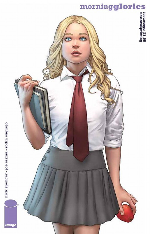
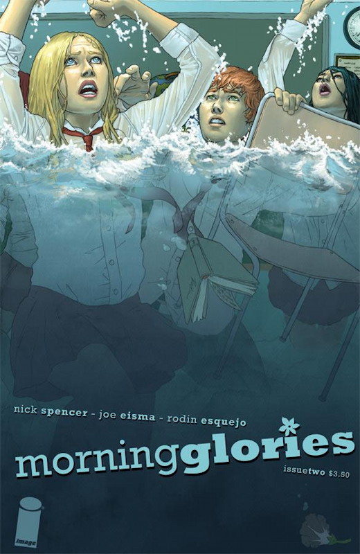
The new series Morning Glories has gotten some good word-of-mouth, so I picked up the first two issues to check it out. At a glance, it looks like it’s going to be a thriller story with a dash of horror: The Morning Glory Academy is a private high school recruiting the best and the brightest – but it has some horrific secrets within its walls. The opening sequence shows a pair of students trying to plumb its depths, and one of them comes to a terrible – well, not end, but close. Then we’re introduced to six new students joining the academy this year, who learn a couple of things: First, that when they contact their parents or anyone outside the school, no one remembers them, and second, that they all share the same birthday.

I’m not familiar with writer Nick Spencer, but his writing doles out just enough surprises and shocks to keep this being a page-turner (although the first issue bogs down a bit showing us perhaps more of the six protagonists’ home lives than was really needed – it’s a classic first issue problem, easing into the story a bit too gradually), and certainly there’s a strong sense of “what the hell is going on here?” Who benefits from terrorizing and molding these students, and what are their goals? There’s some sort of supernatural force at work, but I hope there will be much more behind the academy than simple horror film schtick. There’s too much good stuff here for the story to devolve into being just a horror comic (that, ultimately, was the problem with Joe Hill’s Locke and Key – ultimately, it was just a horror comic).

The gorgeous covers to the series are by Rodin Esquejo, but the interior art is by Joe Eisma, whose angular drawings and awkward layouts don’t really do justice to Spencer’s stories. In particular his faces are generic and it’s difficult to tell the characters apart – a fact which left me confused about the surprise at the end of the second issue until I realized the text was meant to be taken literally. I hope he’ll tighten up his pencils and add some more detail and variety to his art as the series progresses, because right now the art sometimes makes it difficult to follow.

So I can see what the buzz about Morning Glories is about, but it’s still very much a work-in-progress. Nonetheless, it’s pretty different from most of what’s out there, and overall it’s professionally executed, so I’m glad I picked it up. I’m just curious to see how high the ambitions rise for this series.

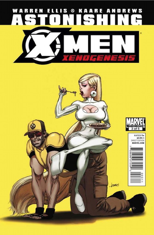
Yeah, I really just wanted to include this issue of Astonishing X-Men: Xenogenesis because the cover is so terrible. Worst cover ever? That’s probably pushing it, but it’s really awful, and of course has absolutely nothing to do with the story. A waste.

Warren Ellis’ story is both a little more interesting and a little less interesting this issue: Much of it is spent with Cyclops and an African dictator posturing and lecturing each other – the sort of moralizing Ellis always enjoys writing, but it’s terribly tediously done here. Otherwise the story is turning into a sequel the Captain Britain stories by Alan Moore and Alan Davis from 30 years ago. (If you want to plunk down the money for it – and it’s very good stuff, but perhaps not this good – you can read it all in the omnibus edition.) Ellis has already brought back the Warpies – grotesquely empowered children formed by a nearby dimensional breach – and brings back a couple of other surprising figures from the Moore/Davis stuff too. I’m mildly curious as to what he’s going to do with them, although I can’t shake the feeling that he’s just plumbing the depths of yet more ancient Marvel history. What’s the point? Why not create something new? Ellis has done some great stuff reworking old comics themes before, but Astonishing X-Men has been far from his best work, stuttering around the edges of the X-Men universe and not really getting to the point – there’s never any payoff. I understand the book has been plagued by delays, but still.

Kaare Andrews’ art: Okay at best. He has all of the weaknesses of Frank Quitely (somewhat-inhuman-looking people, poor backgrounds) with few of his strengths (his characters look ethereal where Quitely’s look solid, Quitely’s layouts are usually strong if stiff, while Andrews’ seem awkward). Visually, the book is a mess, and particular a disappointment given the artists Ellis has been working with in earlier issues of Astonishing.

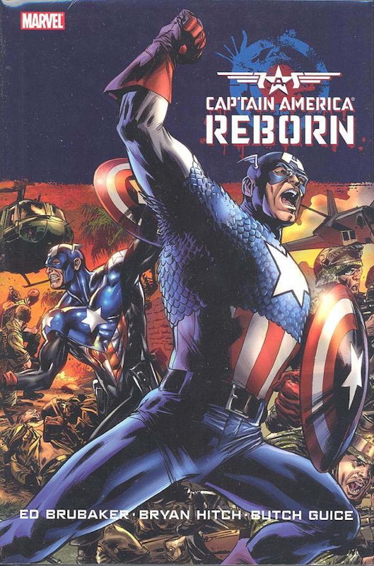
If you want to see some great art, look no farther than Captain America: Reborn, the paperback collection of the series from a couple of years ago, which gets me nearly caught up on Ed Brubaker’s run on the character. Well okay, I think Bryan Hitch is a tad overrated as an artist, his figures being a little too perfect, and he never quite sells me on his characters’ emotions, but boy, you can’t fault him for his layouts or renderings, which are truly gorgeous.

Reborn features Brubaker once again attempting the impossible: Having convincingly brought Bucky Barnes back from the dead, he now bring back Steve Rogers, who was shot twice – once at very close range, by his mind-controlled lover – setting off months or mourning in the Marvel Universe. The kicker, of course, is that Steve wasn’t actually killed, something else happened, something that the mastermind behind events wanted to use to bring Cap around to his side, and Cap’s friends have to prevent the bad guys from finishing the job.

Brubaker doesn’t pull it off as well as he did Bucky’s revival, in large part because Bucky’s story was steeped in cold war black ops and shadowy figures, the sort of stuff Brubaker does best. This is an over-the-top fantasy, which doesn’t play to Brubaker’s strengths, and which features a chain of events which borders close enough to the absurd to make it hard to swallow. It is, in short, a Lee-and-Kirby plot written by a noir detective story guy. Brubaker gives it all he’s got, but I don’t think he quite pulls it off. It’s a fun ride, with many good moments, but it feels a bit awkward next to Brubaker’s other Cap stuff.

But really, if you just want some escapist fiction to entertain you for a couple of hours, you could do a lot worse. As a sort of “event” comic unto itself, and carefully integrated into the larger goings-on in the Marvel Universe, Brubaker naturally has some strict confines to work within. So I think this can be chalked up as a good try, which kept the overall story moving forward. Not bad stuff, really.

And man, the art sure is gorgeous.

Boston in September

I’m back from a week-plus vacation to Boston to visit my parents. Debbi of course also came to visit her sisters, so we didn’t see a lot of each other, since our families live about 40 miles apart. Our strange family vacations. 🙂

We took the JetBlue red-eye the night of Thursday the 16th. Several people asked me if we had any trouble landing, because I guess there was a big rainstorm that night, but when we landed (around 5:15 am) I looked outside and just noticed it had been raining. The trip otherwise was perfectly smooth. Debbi’s sister picked us up and we drove down to spend part of Friday with them. I didn’t sleep on the plane, so I sacked out on the couch even before all of Deb’s niephews (2 girls and 1 boy) had headed off to school. Then I had lunch with Debbi and her sisters, and they drove me up to my Mom’s house.

I saw them once more, on Sunday, when one of the girls had a soccer game near my Mom’s house, so I drove over to say hi and hang out. And then I drove Debbi up on Monday to spend the night with us and have dinner, since my Dad picked up some lobsters from Legal Sea Foods for the three of them. (I don’t eat seafood, so I picked up some ribs from Whole Foods. But the verdict on the lobsters was that they were excellent.)

I visited with two friends – my friend Bruce, whom I know from my old APAhacking days, and my friend Charley, whom I know from high school. Charley asked how long it’s been since we’d seen each other, and I said, “Well, last time I saw you you still had long hair…” He said that meant it had probably been a decade or more, which sounds about right. We’d basically lost touch until I came across his web site. We had lunch in Harvard Square and caught up on various things. Bruce and I, as usual, had dinner in Boston’s North End followed by coffee and dessert at Cafe Vittoria, which is an excellent place to hang out and chat, even if we did have to watch the Red Sox get thumped by the Orioles on the big screen. (At least we got to mock them along the way.)

I spent much of the week hanging out at my Mom’s house, with occasional runs to Dunkin Donuts. She volunteers at the new Waban Library Center, in the building where the Waban branch of the Newton Free Library used to be. It’s a beautiful building, built between the two World Wars, and I went up and took some photos, and reminisced about going there as a kid. (Their Facebook page has photos from 1930 as well as from the modern era.)

I went in to visit Dad and have dinner with him twice, and he also joined me for my usual trip out to That’s Entertainment in Worcester, where I picked up some comic books and Magic cards.

The weather was up-and-down: Rainy and cold when we arrived, then cool, and then hot-and-humid! And then alternating cool with hot-and-humid for the last few days. I used almost all the clothes I brought, including my jacket and sweatshirt. I guess we left just before the rains returned. Though the area already looks like it’s perpetually raining leaves, since fall arrived during our visit.

Our flight home was uneventful, other than an hour’s delay taking off (half of which we made up in the air) – far better than last year’s debacle of a return trip!

All-in-all it was a very lazy vacation, and it flew by awfully quickly. Fortunately Debbi and I are also taking Monday off to catch up on things and recover from the plane flight home (it’s over an hour longer to fly west than east between Boston and San Jose). And the kitties are delighted to see us, of course, after 9 days of 3 different pet sitters! (Though I guess Blackjack did his best to charm everyone.)

Driving in Boston

Driving around Greater Boston is a much bigger pain in the ass than driving around California, for a bunch of reasons:

  • The streets are generally narrower, since many of the roads predate automobiles.
  • People park on the streets, even though they’re generally narrower, making the streets functionally even narrower. Many streets allow parking even though they don’t have a dedicated parking lane.
  • People get out of cars and just amble across the street without looking, usually without caring whether they’re jaywalking.
  • Pedestrians suddenly appear from behind parked cars, waiting for a space to jaywalk across the road.
  • Turn lanes usually aren’t marked until you’re actually in the lane, whereas most turn lanes in California are marked ahead of time, or at least on signs attached to traffic signals so you can see them from a distance. Consequently you often find yourself in the wrong lane because there was no way to tell you were heading into a turn lane until it’s too late.
  • Drivers give you approximately 1/5 of a second to go after a green light before honking at you. Personally this motivates me to drive slowly.

My strategy for driving in Boston is just to be patient and not let other drivers (or pedestrians) get to me. If they’re impatient, well, that’s their problem.

The only bright spot, really, is that Massachusetts has been on a long-term campaign to make drivers aware that they must stop for a pedestrians in crosswalks, and most drivers obey this law. This makes it a little easier to be a pedestrian than in years past.

I’m still not sure why they haven’t just added more lanes to Route 128 yet, though. They’ve been doing construction on it seemingly in perpetuity, so you’d like they could make the most obvious improvement to it.

New Bed!

Our home improvement project of assembling new bookcases for my comic book collection got finished a couple of weeks ago – I now have three 8-foot-tall bookcases (yes, anchored to the wall to guard against earthquakes) holding my collection, replacing the four 6-foot-tall cases. Overall the new cases have slightly more shelf space, so I have a little extra room, and they’re in better condition and look nicer than the 15-year-old things they’re replacing.

But the real reason for installing them is to make more space in the bedroom (yes, my collection is in the bedroom), in order to buy a new bed.

The old bed was also 15 years old, a queen-sized mattress and box spring, and has been on its last legs for a while. We’d actually started wearing through the mattress’ covering, exposing some of the foam. Well, last weekend Debbi talked to her friend Lisa, whom we learned bought a new bed that weekend, and from whom we also learned that that weekend – Labor Day weekend – is the time of the deepest sales in the mattress business. So we headed out to Sleep Train to try out mattresses.

Well, long story short, we bought a new California-king-sized mattress and box spring. Long story slightly longer, there are a lot of different mattresses out there. We lay on about 7 of them, and actually liked the one we bought more than several higher-end ones. Though I knew anything we bought would be much nicer than the one we were replacing.

Also, this just in: Mattresses are expensive!

So yesterday the new bed was delivered. They gave us a 4-hour window for delivery, and arrived near the very beginning of it. The two guys came in, removed the old mattress, assembled the new frame, and put the new mattress and bed spring on it all in about 20 minutes. Amazing, really! We spent about half an hour before they arrived vacuuming under the old mattress (I think most of what I sucked up was Jefferson hair), and another 15 minutes or so removing picture frames from the stairwell walls so they wouldn’t damage anything while carrying the thing up. But it was finished in a whirlwind of activity. (I gave the movers some water while they were there, which they both sucked down. Debbi observed that most people probably don’t offer them anything.)

In addition to being larger, the bed is also taller than the old bed, which means I’ll need to move the shelf mounted on the wall above the bed. But other than adjusting to that, the bed is really nice and comfortable, and it’s much harder for us to feel the other person moving around on it (which should help keep Debbi from waking up when I roll around at night, active sleeper that I am).

Newton has instantly claimed the bed as his own space, snoozing on it even before we put the blankets on it, and curling up with us last night. Debbi noted that the old bed has smelled like him and his brother for years, so he might be trying to make this one smell like him. I said to him that this is the second bed I’ve bought in his lifetime. He really seems to like it.

Last night’s sleep was very comfortable.